New Look
Aligning with our goal to exceed expectations and moving forward in our continuous pursuit of perfection, Barton Construction has a new look!
After serving the Tallahassee area since 2002, we’ve grown as a construction company, expanding our commercial construction services, and we wanted our visual identity to reflect that. Our new branding lends itself to our ongoing growth and acts as an all-encompassing representation of our services including design-build, construction management, general contracting and pre-construction services.
We wanted our new look to be refreshed and elevated while still representing the trustworthy experience, high-quality customer service and dedication to high standards that have earned Barton Construction its reputation. We worked with a local advertising agency to create a clean, updated, authentic and strong brand that brings together all of the different elements that make us Barton Construction.
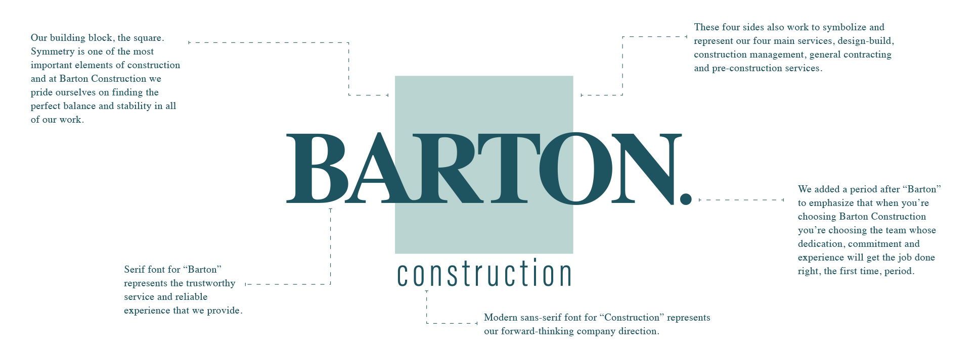
Construction work is all about the building blocks that set up a strong foundation. Symmetry is one of the most important elements of construction and at Barton Construction we pride ourselves on finding the perfect balance and stability in all of our work. We wanted to incorporate the idea of symmetry in our new logo and to do so we included a perfect square. These four sides work to symbolize and represent our four main services, design-build, construction management, general contracting and pre-construction services. The square symbol is also special to us because each side also represents the four pillars that make up Barton Construction’s mission: experience, professionalism, exceeding expectations and exemplary service.
We even put a lot of thought into our font types and introduced a balance with a serif font for “Barton” and a sans-serif font for “Construction”. The classic serif font for “Barton” represents the trustworthy service and reliable experience that we provide in all of our services while the more modern sans-serif font for “Construction” represents our forward-thinking company direction. The serif and sans-serif fonts combined create a balance that aims to blend our modern and updated work with our professional, classic and established reputation.
Lastly, we wanted to focus on who we are as a company. We are the experienced commercial and residential construction company that Tallahassee can turn to for exceptional service and award-winning results. We’re also the dedicated team that tackles construction challenges head-on and strives for perfection in all of our projects. We’re a lot of things ranging from general contracting to commercial construction management, but first and foremost WE ARE Barton. We added a period after “Barton” to signify, first, the time and commitment put forth by our founder, Doug Barton. Second, to emphasize that when you’re choosing Barton Construction you’re choosing the team whose dedication, commitment and experience will get the job done right, the first time, period.
Barton Construction is still committed to maintaining our values and providing the high-quality service that has come to be expected of our company. Still as dedicated to excellence as ever, our new and evolved branding gives us the chance to visually convey the commitment we’ve always had while better representing the services we offer. We would like to take the time to acknowledge everyone who has supported Barton Construction in all of our endeavors, and we’d like to thank you for your encouragement as we roll out our new brand, taking the next step forward in our pursuit of perfection.

